I am implementing something new around here!
Guest posts and reviews!
There are so many great products out there that I
haven't tried or just cant afford.
So I decided that guest reviews would be a great
way to expose myself and this blog to a wider range of
products. Plus guest reviewers will have a fresh, new perspective!
Our first review is by the lovely Jenelle!
Below is Jenelle's review of Starrydance Cosmetics as well as her
swatches and photos!
Enjoy!!
A very sweet friend of mine is opening up her own cosmetics shop,
so when she asked for volunteer testers, I jumped all over it.
I found the colors to be well pigmented and very wearable.
While I favor bright colors, I think these colors would be wearable on anyone.
I did find the finish to be very similar across the line,
and I hope that SC ends up branching out into some matte’s and/or pearls rather than all shimmer and sparkle.
The pigments blended really well.
Most were very opaque and the ones that were on the sheer side were buildable.
The colors all match well with each other.
While not all of the pigments are vegan, they are clearly marked.
The beta samples came in baggies,
though when the shop actually launches the samples will come in 3g jars.
I adore Gwynn’s artwork and I’m excited about her plan to create a piece for each
color that will adorn the top of the jars. Even on the sample jars.
Included with the baggies of pigments was a long letter outlining the colors,
their inspiration, their ingredients, and whether or not they were lip safe.
It also covered the future pricing.
5g jars with sifters will be $5, 3g jars with sifters will be $3.50,
and ¼ teaspoon samples in 3g jars without sifters for $2.
While this is more expensive than other sample programs,
the fact that it comes in a jar with custom art makes the price reasonable.
As is, I would probably purchase the mid size for $1.50 more.
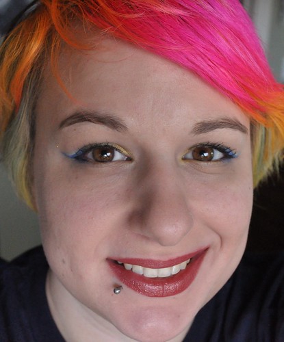
I also wore the shadows for 17 hours with very minimal creasing.
I have rather hooded eyes so it is nearly impossible for me
to not have at least a tiny amount of creasing.
I did use MAC Painterly and MSC’s Awesomesauce, but that’s a normal routine.
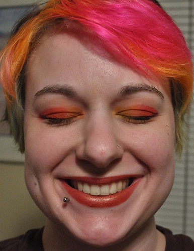
Color Descriptions and Swatches!
Maneki Neko – “A creamy, light golden yellow with extra golden sparkle inspired by the “Lucky Cat” or beckoning cat.”
This pigment is a buttery soft yellow with a nice shimmer finish and a medium amount of golden sparkle. I find Maneki Neko to be one of the easiest colors to mix into a look. It applies mostly opaque but could be dusted away if you wanted a softer addition.
Masquerade – “A light pink with golden and pink sparkles inspired by the mystery and magic of the Masquerade” (I believe this has been renamed Pink Elephant).
The only pink I received, it’s a fairly neutral shade. It’s almost a tan pink due to the bit of gold. As with Maneki Neko there is sparkle, but it’s not overdone.
World Tree – “A rich green with blue, teal, and golden highlights and soft duochrome. Inspired by one of my favorite myths of the Tree of the World that connects the Earth to the Sky.”
It’s a soft, almost minty green, if you don’t catch the duochrome. If you do, it’s bright greenish teal. WT is easily my favorite color in the batch. I’m extra partial to greens anyways, but I’ll probably be ordering a full size of this color when Starrydance launches.
Leviathan – “A light blue with purple tones, with turquoise and white sparkle inspired by the dragons of the deep blue sea.”
A bright, without being too bright, blue. I see teal, but I don’t particularly see purple tones. This pigment has a good deal more sparkle in it than the other colors. It certainly has the shimmer finish like the others, but the sparkle is more pronounced. It’s not overwhelming, though, which I appreciate. I like sparkle in my shadows, but only in moderation.
Kirin – “A rich teal with turquoise and golden sparkles. Inspired by the Eastern Unicorn, the one with the curved horn and scaled sides.”
Next to Leviathan this color looks green, but on its own is a very bright teal. Slightly less sparkly than Leviathan. This is my second favorite color in the set and it looks fantastic paired with World Tree.
Hatchling – “A soft dreamy purple with pink and gold sparkle. Inspired by light things. (May also be named Butterfly.)”
A soft, silvery lavender. It is obviously purple in person, but it photographs very grey. It’s an excellent companion to Starrydance.
Starrydance – “A rich purple with teal undertones, crazy amounts of holographic sparkle, pink, gold, white and turquoise glitter! Inspired by all of my favorite things.”
This is a lovely blue-purple pigment. It’s almost duochrome. With a comment like ‘crazy amounts’ I expected a little more sparkle, but it’s actually the perfect amount for me. I love this purple. This will be another that I’ll buy a full size when Starrydance opens.
Storybook – “The perfect pink tinted cream with lustrous golden sparkle. Inspired by one of my very favorite things – books – and their creamy pages.”
While it’s certainly pink tinged, this is a cream, not a pink. It would be a great highlight for pink or purple looks. Lots of shimmer and a medium sparkle.
Sphynx – “The most perfect metallic bronze color with gold and purple tones and sparkle. Actually an oops color, it reminded me of one of my most beloved creatures – the Sphynx. Half woman, half cat, all book loving. Why the Y? Why not! <3”
It really is the perfect bronze. The slight tinge of purple makes it extremely mixable with the other tones in the collection.
Grimalkin – “A dashing silver purple, with more silver glitter. Inspired by the mystical gray cats of legend associated with Faeries, Witches, and mischief.”
Grimalkin is in between Starrydance and Hatchling in shade. Less blue than Starrydance and more silver than Hatchling. All three look like a gray purple in the bag, but photograph more on the silver side.
Key to My Heart – “A beautiful warm gold with pink, purple, and golden glitter. I love golds!”
I suppose I see this more as a warm tan than gold, but gold is not a stretch. The off color glitter gives the pigment a nice warmth. This is a new favorite neutral.
White Stag – “A fierce white with strong golden duocrome sparkle with just a hint of green in its depths. Inspired by one of my TRULY favorite creatures – the White Stag, heart and king of the sacred forest.
I found this color to be a touch too translucent. The duochrome was certainly visible, but if the light was wrong, I could hardly see the color. I was able to build it up, but it took a little more than I would like. I suppose the subtleness would make it a great highlight. I certainly like the color and the touch of green is fantastic for my eyes.
Celestial Collection –
Sol – “A “white” with attitude. Goes on smoothly creamy white, with a strong red and orange duochrome and golden sparkle.”
This color is reminiscent of an opal. Seemingly milky white, but with an inner pinkish, orangish fire. I need to use this color more.
Luna – “A white with turquoise and golden duochrome.”
I would not bill this as a white, as is. It’s a beautiful color, and reminds me of an aquamarine, but is not particularly a white. If you were able to add white without eliminating the amount of duochrome I think that would be nice, but the light blue works well for a color named “Luna” as well. Also, the duochrome comes off blue to me, not particularly golden. Also, while it’s different from Stella, the amount of blue makes it look really similar. My recommendation is to white it out and play up the gold angle a bit more.
Stella – A white with purple and a soft teal duochrome.”
Next to Luna, the duochrome looks more periwinkle than teal. This is another pigment that goes on fairly sheer, but can be built up.
Night Sky – “A pewter blue with purple tones, and purple and gold and pink glitter.”
A wonderful periwinkle blue. It’s a touch on the silver side, which I assume is the pewter reference.
Galaxy – “A rich metallic silver, purple, and teal mixed into black with gold, holographic, and all kinds of other glitter.”
It’s more a gun metal than a black. I have a hard time working with, and finding, a true black. The sparkles remind me of the night sky. I have yet to try a look with this color, but I plan to soon.
Nova – “Pure glitter bliss – Holographic, purple, teal, pink, white, silver, everything!”
OMG glitter! I’m not particularly good at using loose glitter, but I do really like this particular blend.
For more information about Starrydance Cosmetics please visit the fanpage on
Facebook!
So what do you think of Starrydance Cosmetics based on this review and pictures?
What do you think about the guest review feature?
If you have a product or brand you would like to guest review please
email me @ glittermomto6@aol.com
Thanks to the lovely Jenelle for her review and pictures!!


